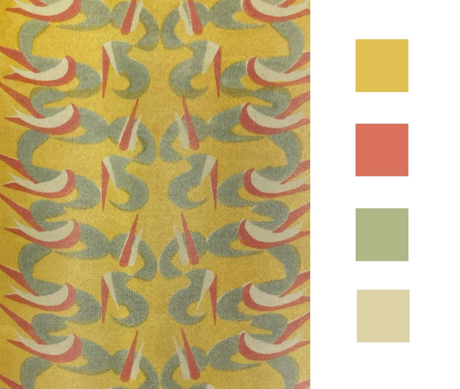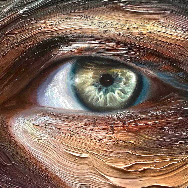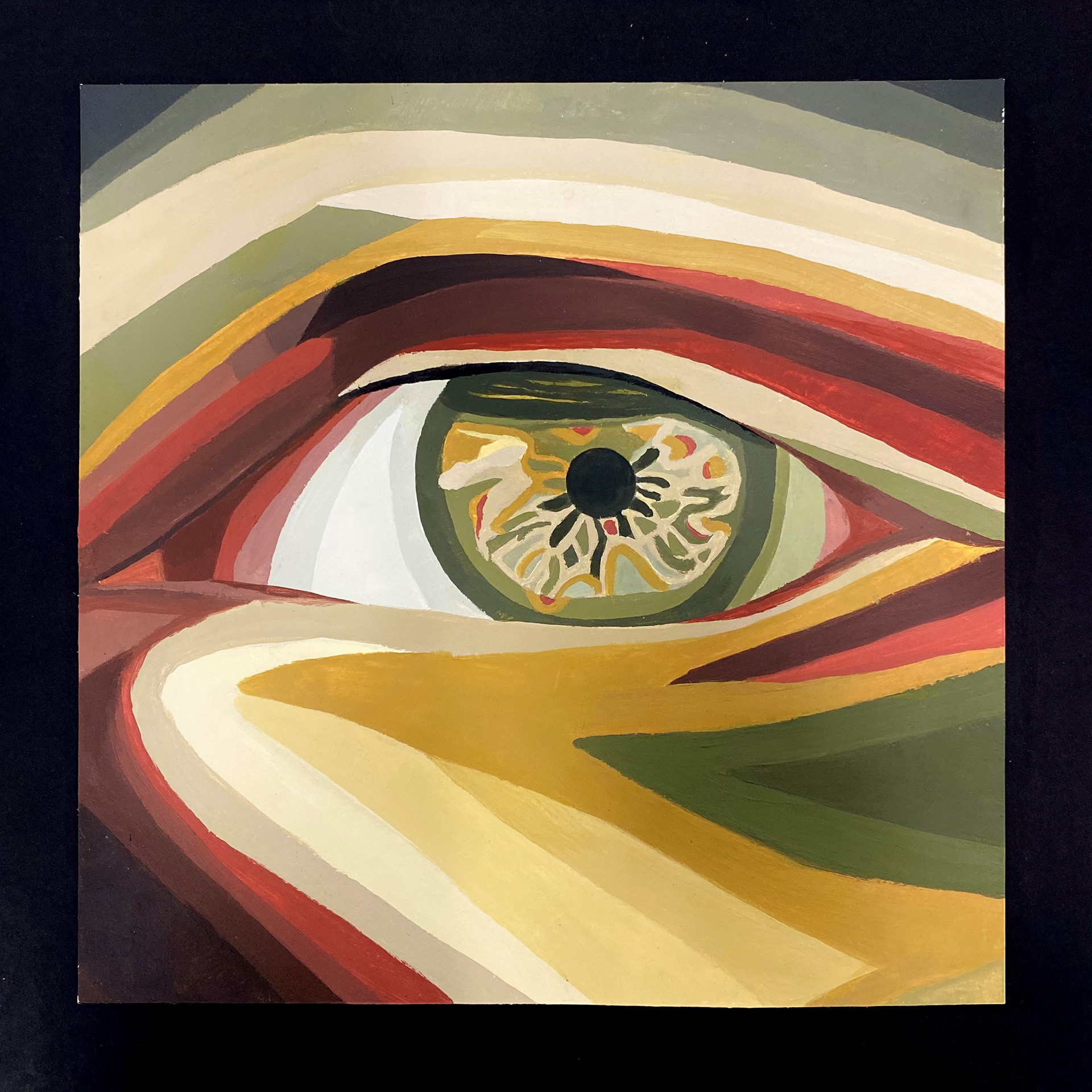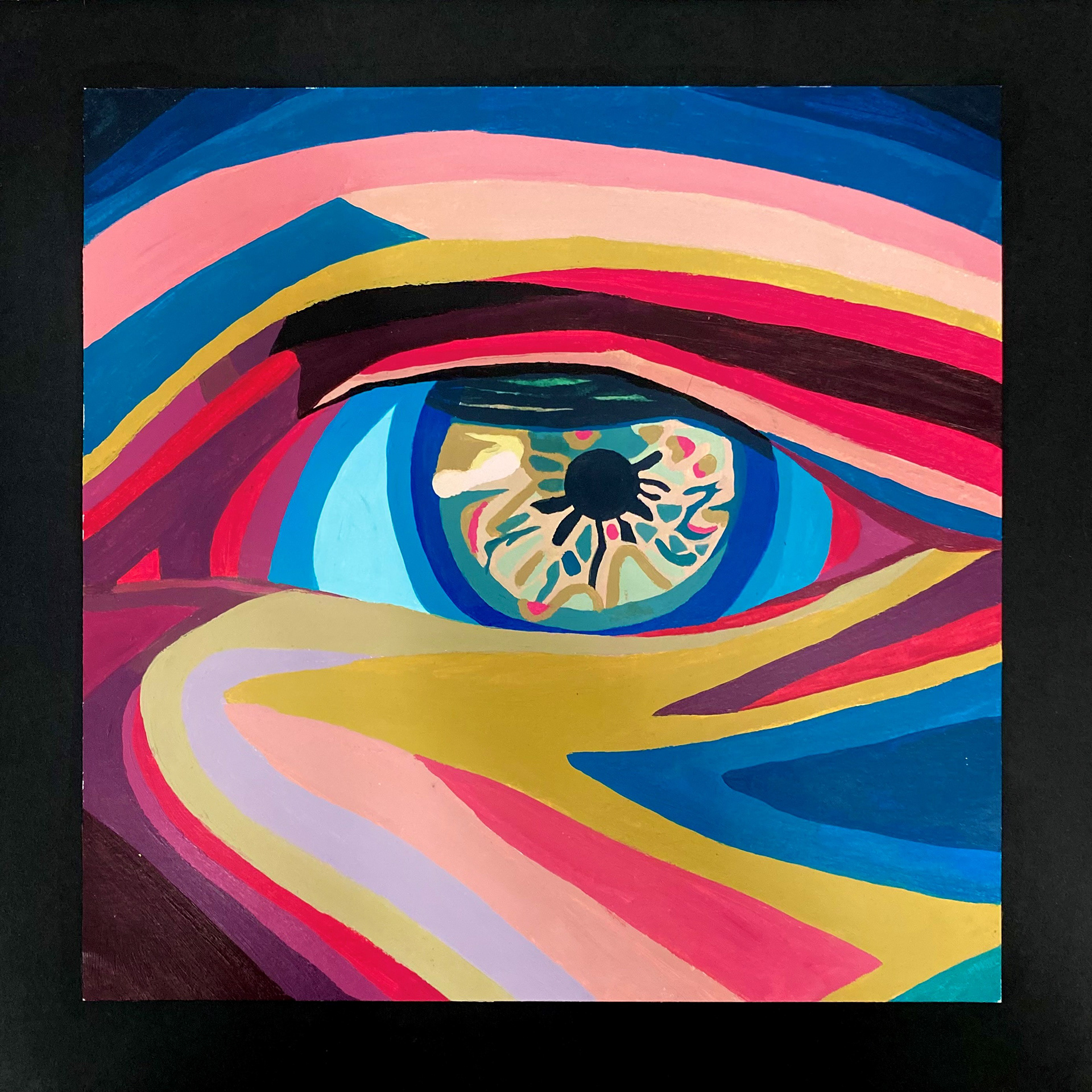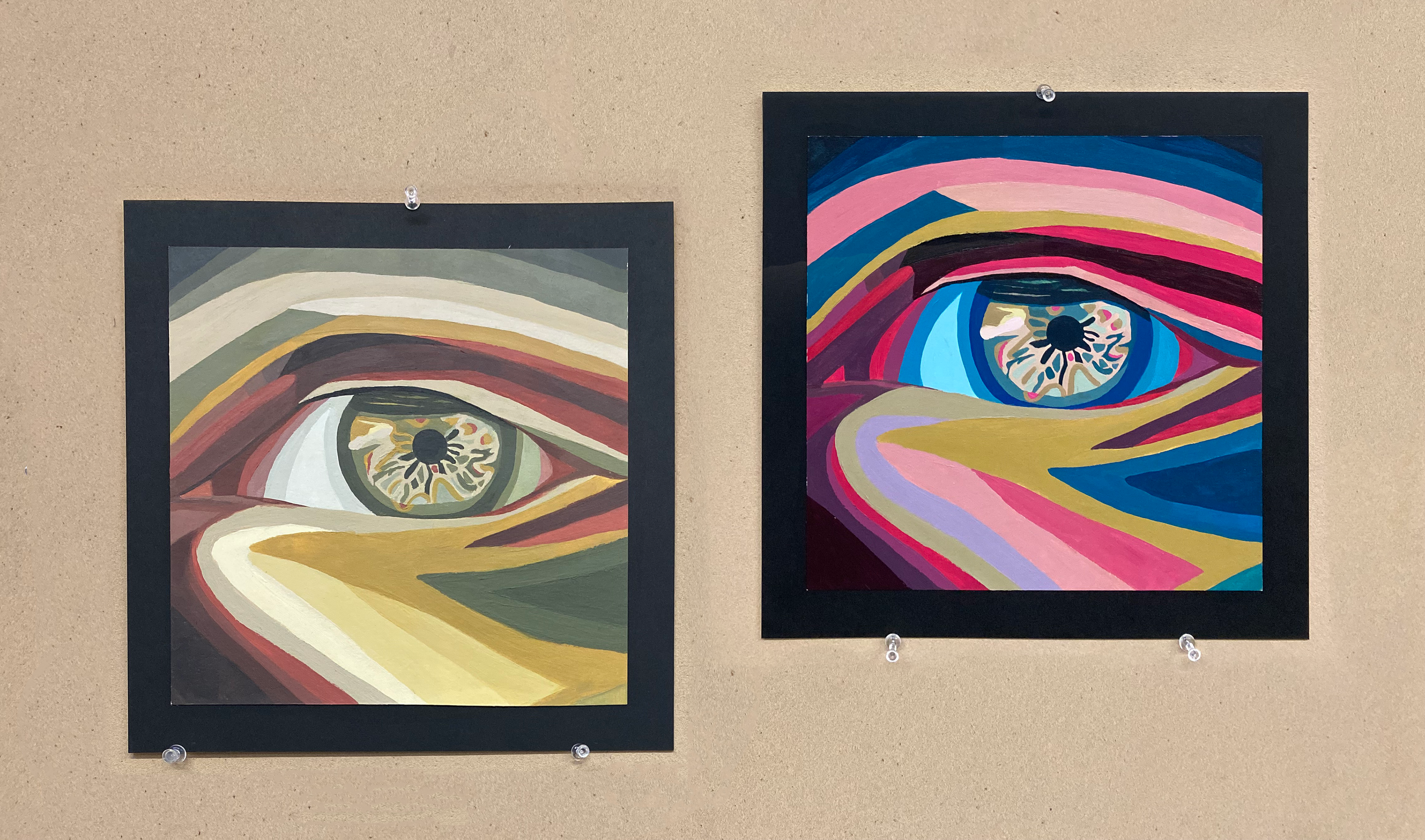
This piece explores how color influences emotional response in art. They are both 10" x 10" Bristol boards, done with Utrecht acrylic paint. For the first panel, I used the palette from an existing work, applying only tints and shades to paint an eye, avoiding gradients and natural skin tones. The earthy and calm colors resulted in a serene atmosphere. The second panel was designed to evoke the opposite emotion, created with a palette of my own choosing. The result was bubbly and vibrant. This project allowed me to experiment with color psychology and deepen my understanding of how color choices impact mood and interpretation.